

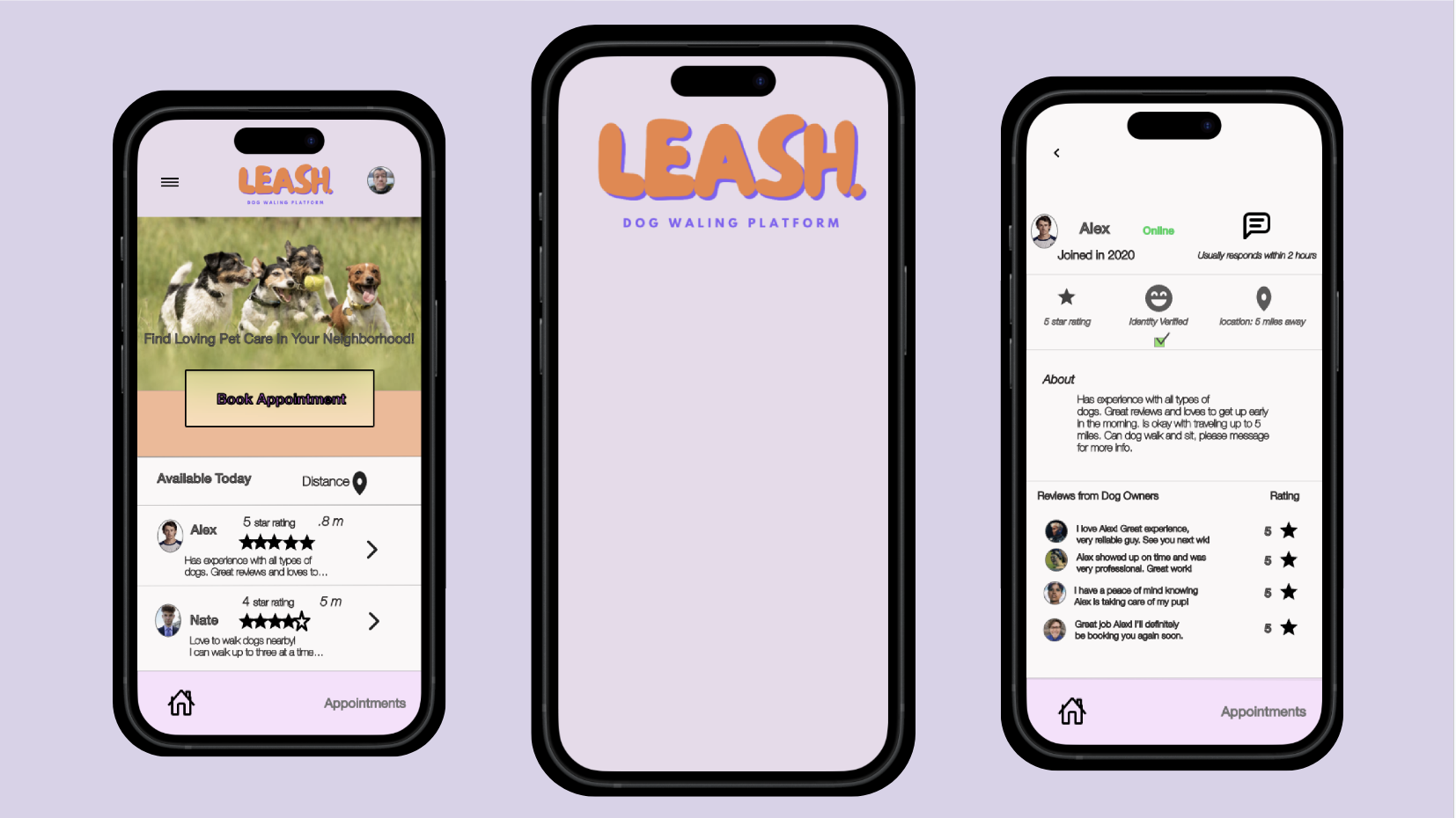

Over 5 iterations this is the final version to create a digital wireframe, taking the best elements of previous drafts and compiling them into the homepage version Keeping user research and information architecture in mind.
For adaptive design, and since Leash’s target audience views the functions of the app from different platforms, I created a tablet/website version and a mobile version.

In the initial design phase, I based decision-making on user research and peer feedback. Incorporated responsive design elements for mobile and tablet versions.

Early designs showed a lack of information on the homepage in terms of the available dog walkers. Also, there was an ask to create a hamburger icon that showed more options for the user.
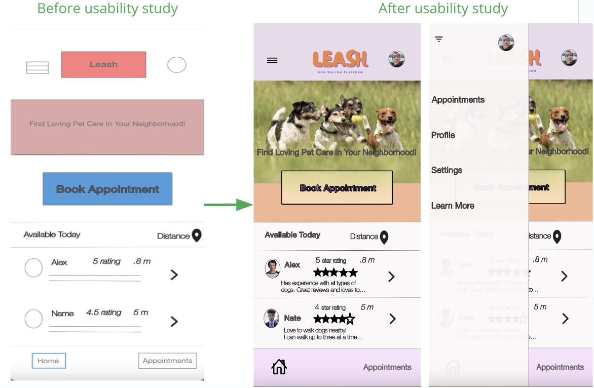
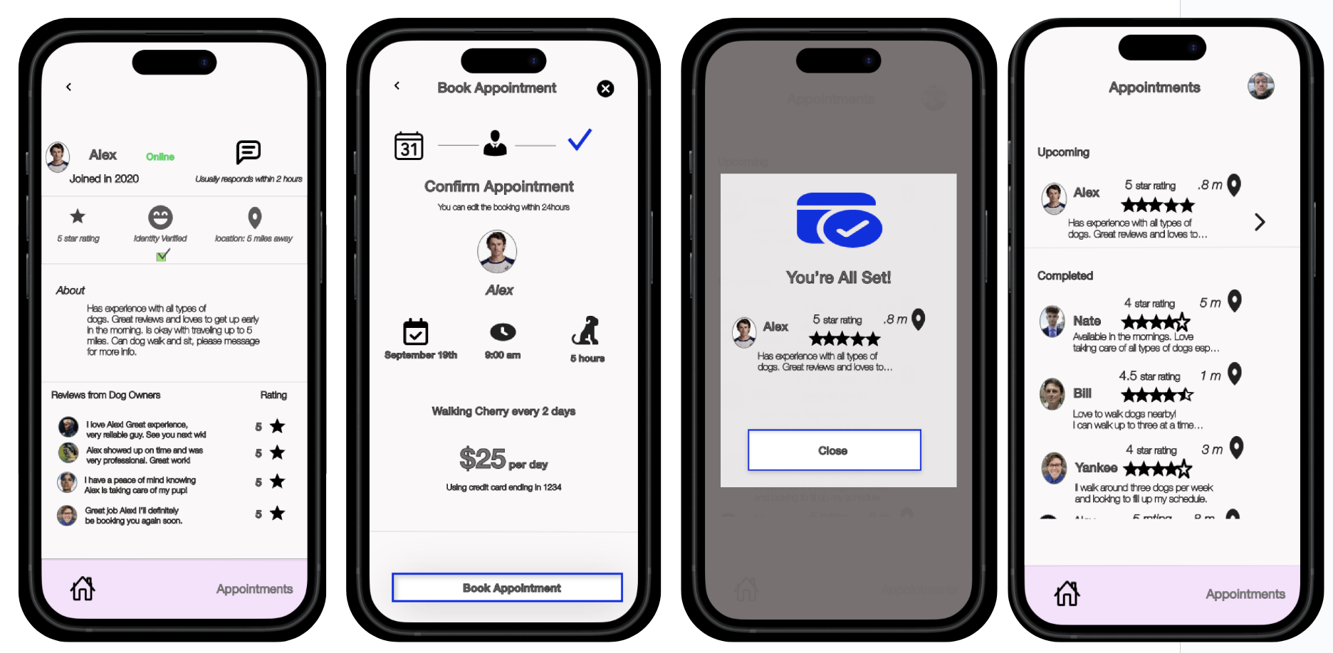
To make the user flow even easier, I added clearly identifiable icons and the ability to exit the page at any point, and go back to previous pages. I updated the typography and graphics to fix the clutter and spacing issues reported in the second round of research.

If you like what you see and want to work together, get in touch!
Either way, let's get in touch!